How not to build a music streaming app: Learn from Gaana.com
Before I start, have a look at these screenshots:
Preface
I have been using Gaana since 2016. I switched from Saavn to Gaana solely because of their UI and dark mode. Parineeti Chopra being their brand ambassador and me loving her (for totally different reasons) had nothing to do with the switch. Really.
Slowly, their UI started to bloat up with unnecessary features and elements causing eye sore. But I was using their service anyways because I primarily listen to Telugu songs and they have fantastic collection overall. Things changed when Spotify came to India and started offering Telugu collection. And that’s when I switched to Spotify. I had quit my job recently and so decided to cancel my Spotify premium subscription because I already have a yearly Gaana premium subscription. That’s when I realised even more, how much terrible Gaana is. At everything. Okay to be fair — not everything, they have a superior offline mode. I don’t want to talk about how Spotify is better at everything — UI, UX, PersonalisedMixes,so I won’t be doing a comparison post.
Why is it so bad?
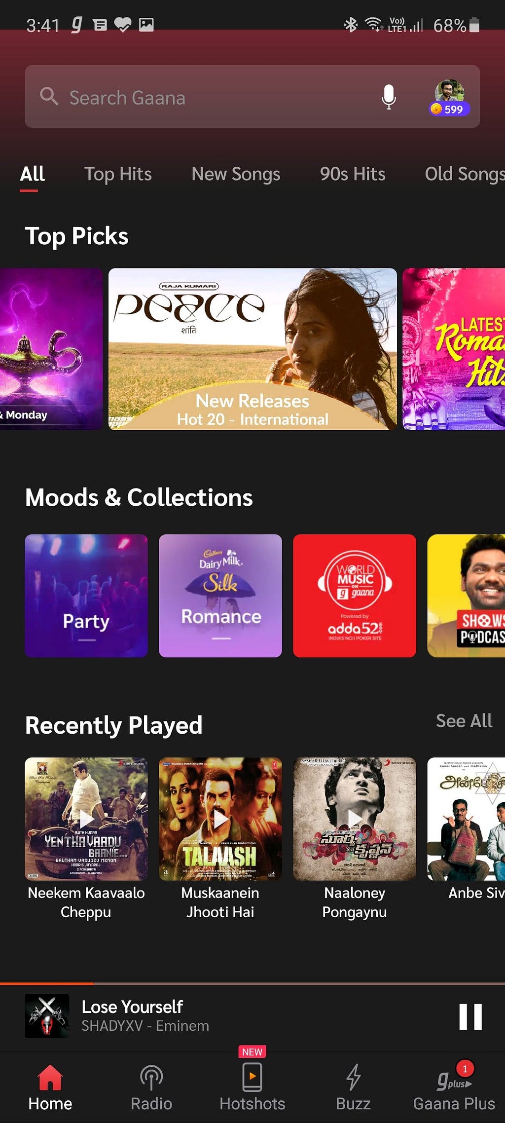
Home tabs
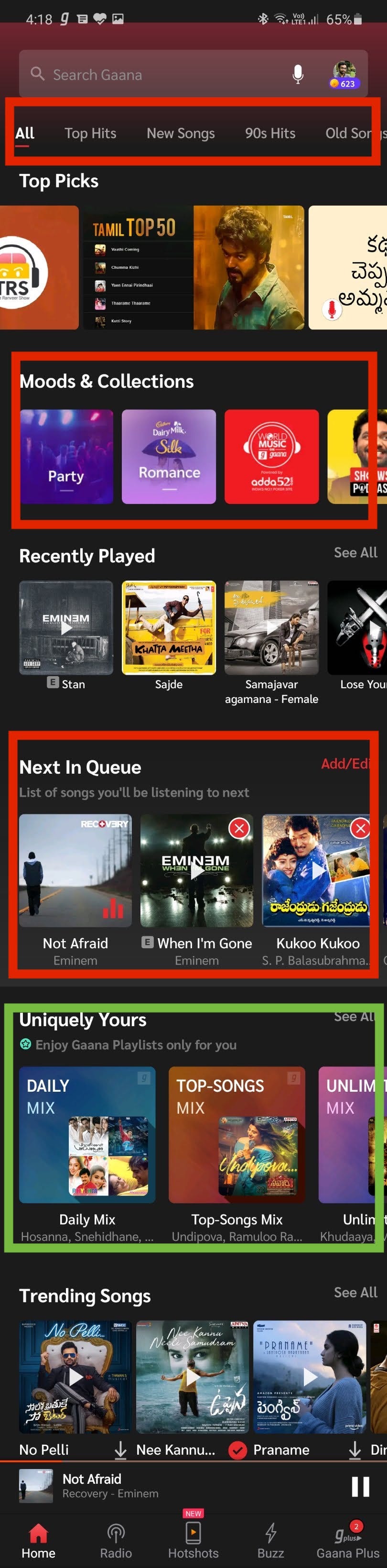
Why are there 32 unnecessary sections? Why are there 64 tabs in the top? Why are there 128 moods & collections? (Sarcasm). Prioritise the information on screen.
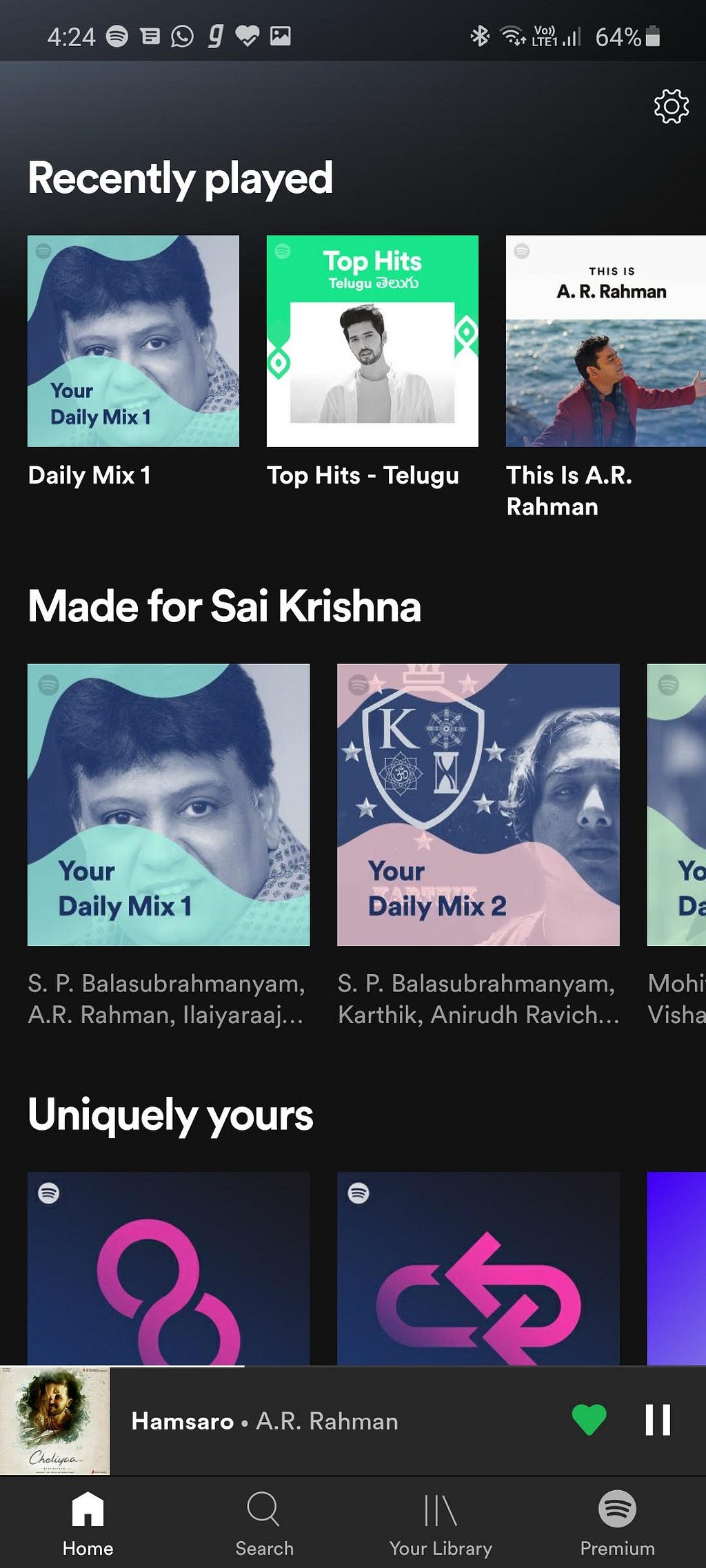
Why is the most important section ‘Uniquely yours’ aka Mixes buried deep down? I had to scroll twice to see it on my S10 Lite which itself is a tall phone.
You have huge collection, we get it. But just don’t throw it on user at once. Read: Actionable Information.
Player Screen
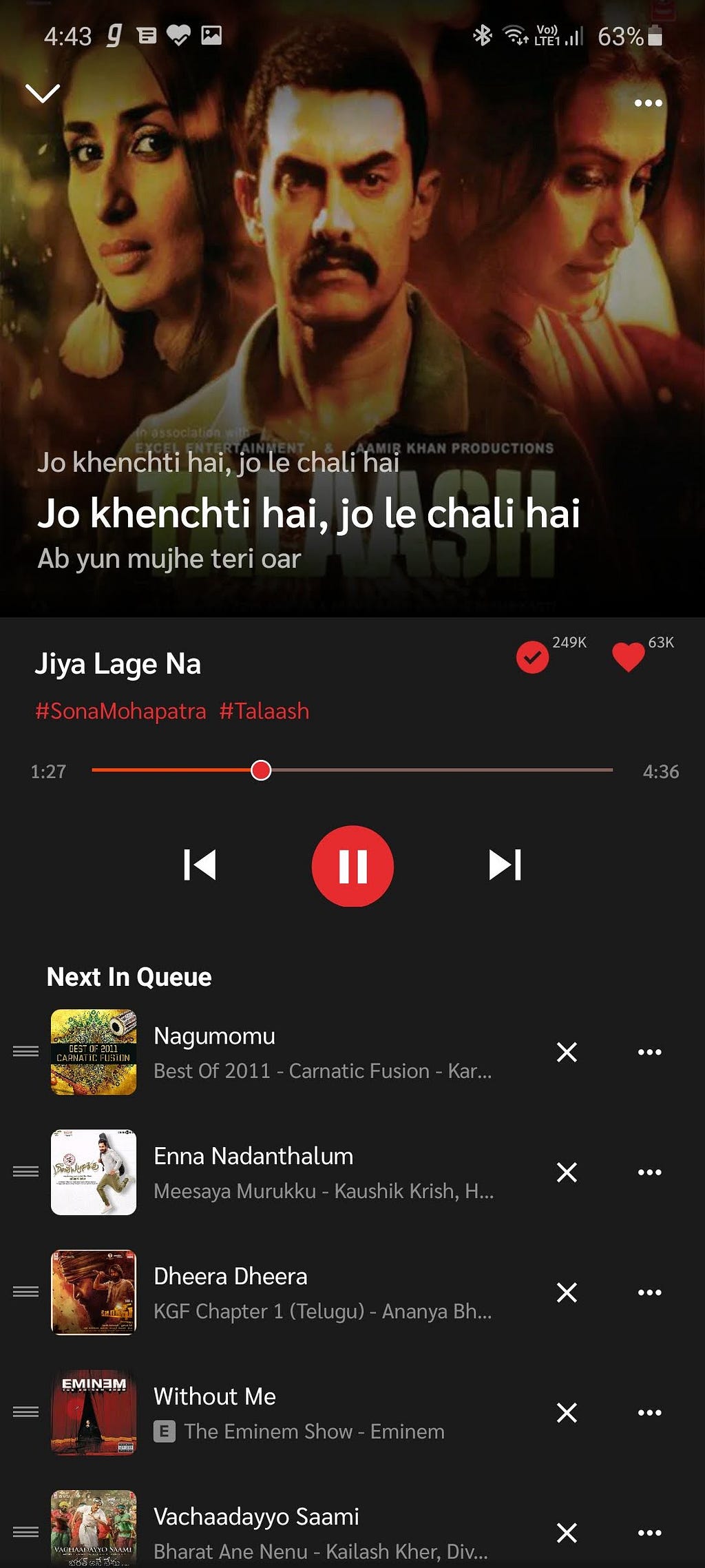
Rule no. 1:
Nobody gives a **** about those numbers — How many people downloaded it or liked it.
Rule no. 2:

Seriously, at least not at the cost of immediate actionable elements like — let me remind you — Repeat/Shuffle options. Where are they by the way?
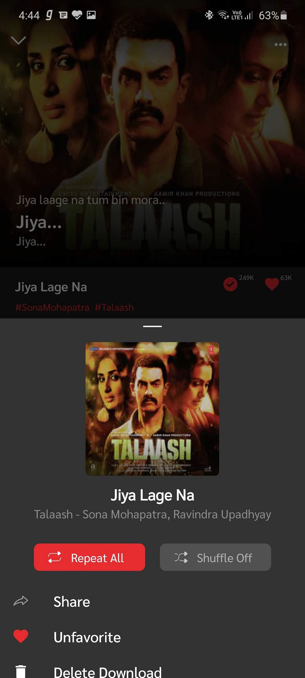
That’s right, hide them. I was listening to the same song for 15 minutes until I realised that I had turned on ‘Repeat one’ and closed the app previously.
Give an option to hide the lyrics — A simple tap toggle? If you are gonna take half of the screen for queue (which has no way to be collapsed) what’s the point of that 2–3 line lyrics making that area clumsy? A small side request — remove the hashtag from artist name and album name under the song title on player screen.
There are 10 unnecessary elements (12, if you count the stats for download and heart icons) which can be removed in the queue component.
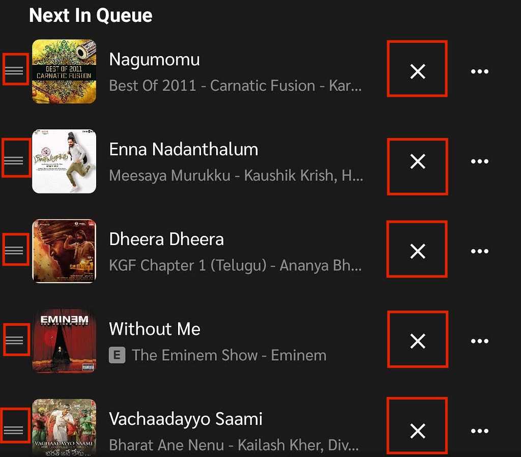
Use a swipe left gesture to remove a song from queue
Hold the song for rearranging the queue
Or simply change the colour for these two icons to a dull one.
Radio Tab
I don’t care. Haven’t used it, probably won’t.
Hotshots Tab

Okay, seriously this new “tiktok-like” feature gave me the final push to write this post. Come on Gaana, we don’t need another tiktok which was banned recently, for good. But if you insist about increasing user base, app usage I don’t really care as long as it is not visible to my eyes.
Buzz Tab
Zero *****
Gaana Plus Tab
I’d like to believe this should be a tab for My Account, My Music, Settings, Misc. Preferences etc. But could I be any more wrong?
Why are you spamming your app with your own content? Don’t throw everything at user everywhere. Sorry for the very lengthy screenshot below but I had to embed it to show you how deep the ‘Listening history’ section was buried.

Web App
Don’t even get me started on the web app. I’ll just mention a couple of my problems.
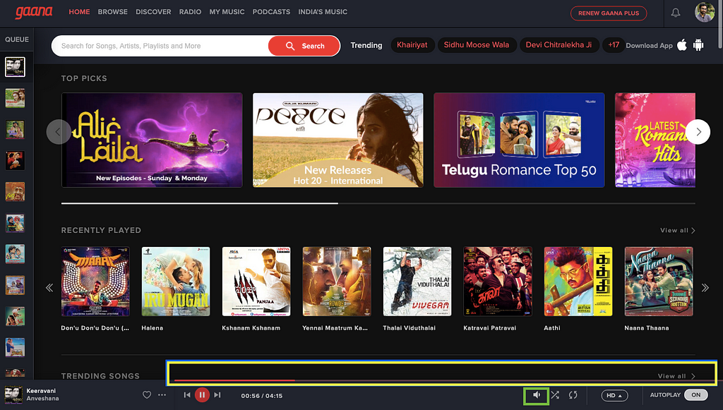
Who thought it was a good idea to place progress bar on top edge of the component? To seek a song, I have to carefully hover the mouse on that tiny element in order not to click on a song above which will start playing by accident. It’s stressful. 1st world problems. (I actually live in India, so..)
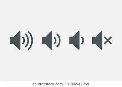
And that volume icon — to my mind — having built several desktop, mobile and web apps including a music player, it means the volume is set to a lower level. Kindly use different icons like below to indicate volume level.
Conclusion
Reduce clutter in UI
Improve UX (cc: Spotify)
Improve Mixes, vastly (cc: Spotify)
Show information on screen based on actionable importance
Have a consistent UX between web and mobile apps
Who am I?
I’m a huge music and movie lover. I’m also a techie and serial entrepreneur who had build multiple desktop, mobile and web apps with millions of downloads. Long shot, you *might* have known mhotspot (A windows software to turn your laptop into wifi hotspot). I take so much care in building my products. You can know more about me here: https://saikrishna.me
Why I was so serious on UI & UX of Gaana?
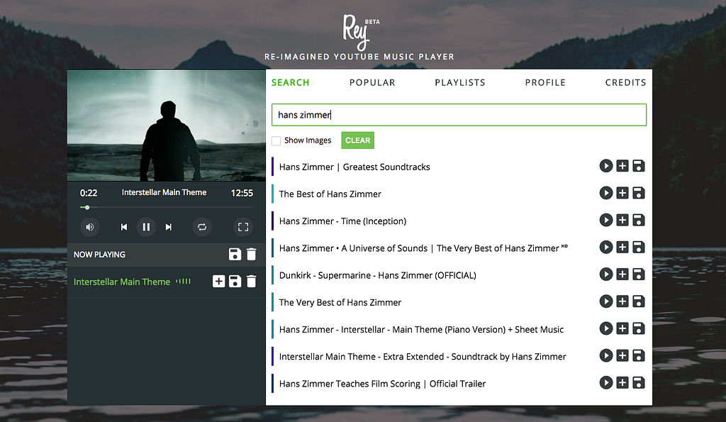
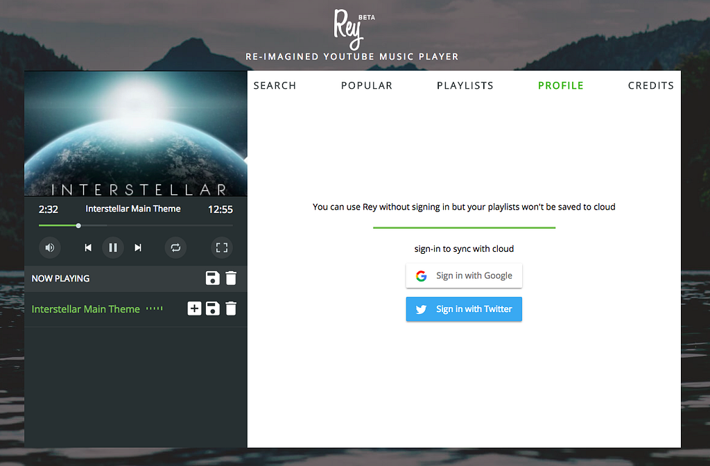
As I said above, I love music and elegant apps. I had built an open-source music player app, Rey, which acts as a beautiful front-end for Youtube.
Reason to build:https://www.reddit.com/r/Music/comments/8sxjxo/rey_reimagined_youtube_music_player_for_desktop_i/
For developers: https://www.reddit.com/r/javascript/comments/9fjflv/reimagined_youtube_music_player_for_web_opensource/
The app’s API quota is revoked by Google because I didn’t want to enter certain information in a certain form. You can download the app’s source code and run it locally with your own credentials.
I just don’t want my favourite music app (especially for telugu collection) to become horrible. Dear Gaana, please don’t take this post in a negative way. Thank you!